Santa Clara Startup
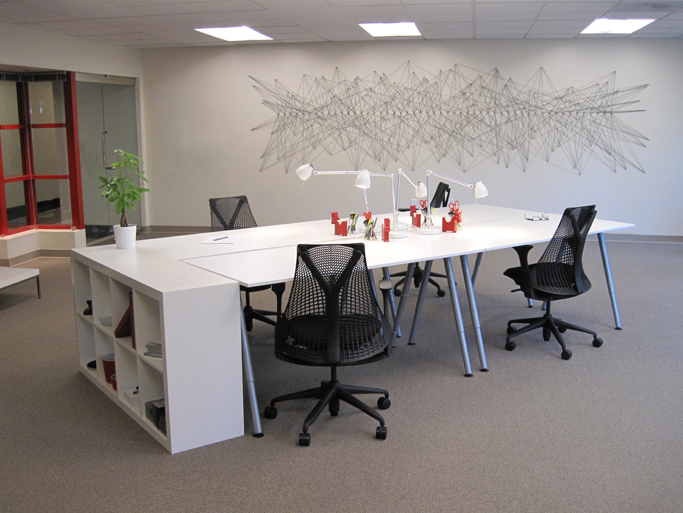
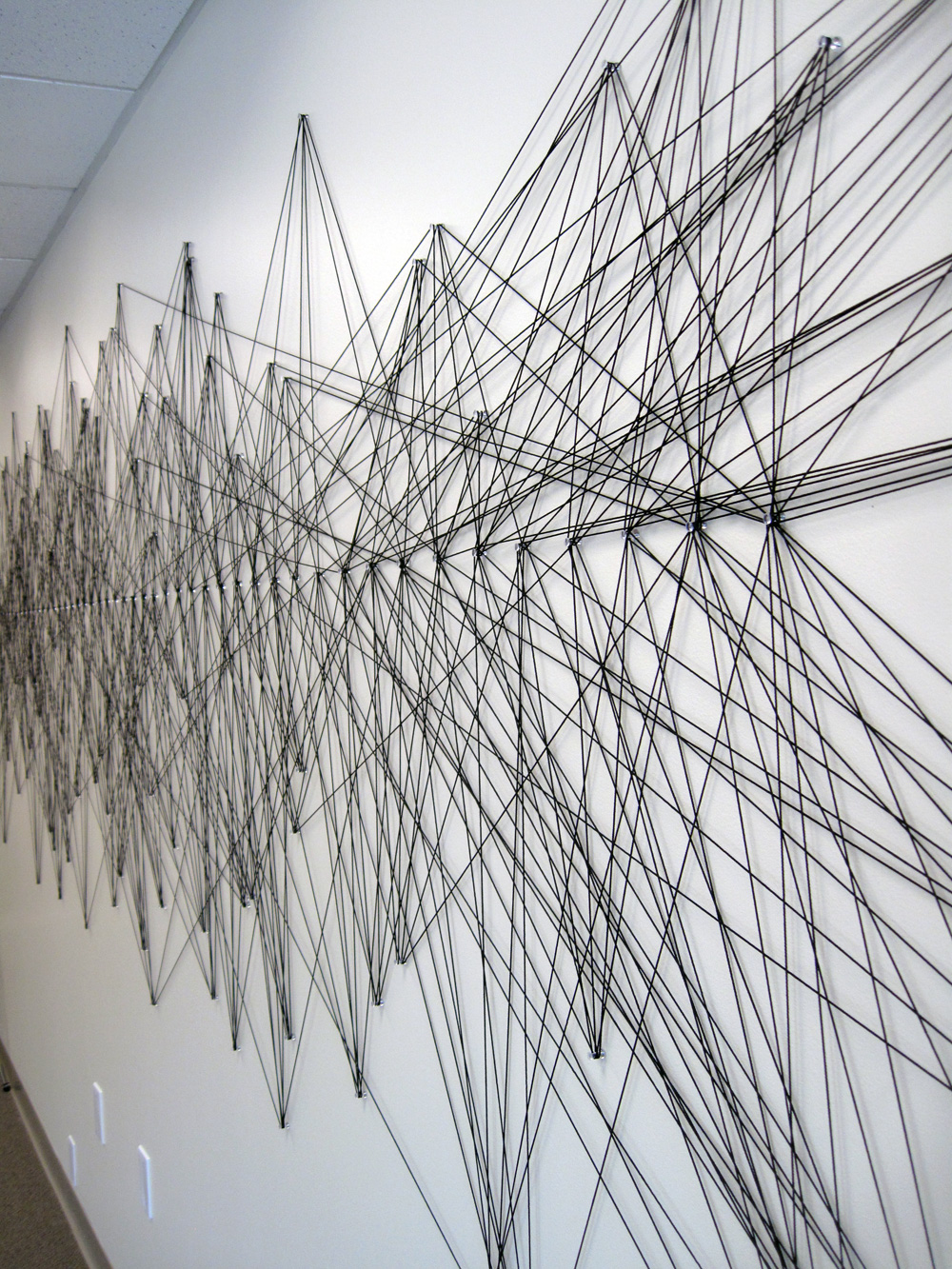
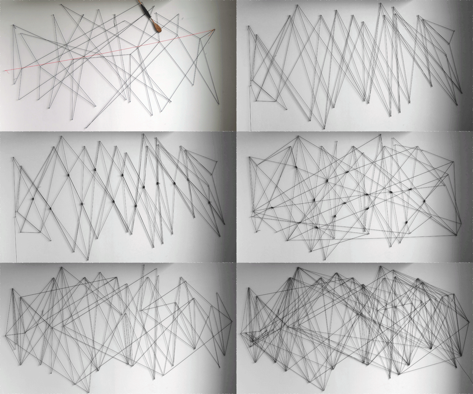
This client needed a very quick turnaround on a rented workspace for his new financial start up. We planned the space before the company had an official name. A major component of the work included a custom installation on the main wall to act as a graphic placeholder for their yet-to-be determined brand identity. Using only push pins, black mason line and a few hours, we produced a design that evoked the founding principles of their company. Having invented an algorithm that could identify opportunities from the chaos of the financial market fluctuations, the company asked for a visual representation of this idea. The black lines haphazardly splay across the wall finding organization along a single internal alignment of points. Originally intended as a temporary installation, the logo has been up for over a year and has lasted as a clear identifier of the company’s brand and values.


